Software Development Metrics: What a CTO Actually Tracks (and What’s Just Noise)
Your team can hit every number on the dashboard and still be losing. I’ve watched it happen. Velocity is up, the burndown chart looks clean, every sprint closes on time, and the product still isn’t getting any better. Everyone is busy, and nothing is landing.
So when you search “software development metrics” and the top results promise you 15, then 23, then “30+ metrics to track,” be careful what you wish for. That’s the problem itself. A dashboard with thirty numbers on it is a dashboard nobody reads, and half of those numbers are lying to you anyway.
I’ve spent twenty years building and running software teams, and today I run Full Scale, where we manage more than 300 developers across more than 80 client companies. That scale forces a question on us constantly: how do you measure productivity across that many people, most of whom none of us can see working because they’re eight thousand miles away? Every so often a client tells us one of their developers doesn’t seem to be performing, and we have to figure out how to actually measure whether that’s true. We’ve had to answer this for real, many times over.
Measuring people you can’t see changed how I think about all of this. When you can’t watch someone work, you stop caring how busy they look and start caring only about what they ship and whether it held up. It turns out that’s the right way to manage everyone.
Here’s the part the dashboards bury. If you’re a good manager and you talk to your team every day, you should already know how they’re doing before you open a single chart. You know what each person is working on. You know who’s stuck, who needs help, and who needs clarity that you have to go get from somewhere else. The numbers don’t hand you that knowledge. They confirm what you’re already seeing, and they catch the things you can’t see on a big or distributed team.
A good manager already knows how the team is doing before the dashboard does.
So this isn’t an argument against measuring. You don’t need thirty metrics, you need about six that are hard to game, plus the judgment to read them. This is my list, plus the ones I ignore and why. It’s the instrument panel I’d put in front of any engineering leader, and it’s built on the same ideas I wrote about in my book, Product Driven.
The metrics that lie to you
Start by throwing things out. Here’s the oldest truth about software engineering metrics: whatever you measure, you get more of. Tell people to focus on story points, or lines of code, or how fast they approve a pull request, or how many times a day they deploy, and you will get more of every one of those things. The problem is that none of them delivers more value to a customer. They just track how busy everyone looks. Economists have a name for this. It’s Goodhart’s law: when a measure becomes a target, it stops being a good measure.
These are the ones I won’t put on a dashboard.
- Lines of code. The volume of code says nothing about the quality of the thinking behind it. A strong engineer often solves a problem with less code, or by deleting some. One of the top-ranked guides for this very keyword still lists “amount of code” as a productivity metric and suggests a high number “might indicate developers were productive.” It might also indicate they wrote a mess that someone else has to clean up. Measuring a developer by lines of code is like measuring a roofer by how many nails he used. The number is real, and it tells you nothing about whether the roof keeps the rain out.
- Commits and pull requests. All this really counts is how often work gets checked in. Anyone who wants a bigger number just splits one change into ten, and now there are ten pull requests carrying the same amount of value.
- Story points and velocity. Track these blindly and the estimates quietly inflate. Reward velocity and the team hands you bigger numbers without shipping anything faster, because a story point is just a team’s estimate of its own effort. There’s a smart way to use them, which I’ll get to in a second, but raw velocity on a dashboard is a vanity number.
- Hours and seat time. This tracks who showed up, nothing more. The developer at the keyboard all day might be the one creating the cleanup work that lands on two other people tomorrow.
- Individual developer rankings. This is the one that does real damage. The second you rank engineers against each other on any of the numbers above, you teach them to optimize for the number instead of the work. You also punish the senior engineer who spends her afternoon unblocking three teammates instead of padding her own commit count. Software gets built by teams, so grading the individual measures the wrong unit.
- Code coverage. An 80 percent coverage target sounds rigorous, and it’s trivially easy to game. A test can run a line of code without ever checking whether the result is right, so a high coverage number often sits on top of tests that prove almost nothing. Treat it as a smell test and nothing more.
I learned this the expensive way years ago at Stackify, the developer-tools company I founded. We had a solid roadmap and we shipped constantly, and the activity charts looked great. We once spent ten thousand dollars sponsoring a developer conference for a big launch and got zero new customers. We measured the shipping and forgot to measure whether any of it mattered to the people we were shipping to. If you want the longer argument for why outcomes beat activity, I made it in detail in why most teams measure productivity wrong.
When story points actually earn their place
Story points get a bad reputation, and most of it is deserved. Used as a scoreboard, they’re noise. But used the right way, they’re one of the more useful things you can do with a team that’s struggling.
This is where the velocity tracker comes in. When a client flags a developer who doesn’t seem to be producing, or one of our own teams isn’t performing, we’ll put them on what we call a velocity tracker. Each person estimates their own work for the week in story points, and then we track whether they hit what they said they would. It helps, and not for the reason you’d guess. It has almost nothing to do with the points.
It helps because it forces people to stop and actually think about how long something will take. Most of us never do that. We just start. And because the developer gives the estimate, I’m not holding anyone to a number I invented. I’m holding them to a commitment they made themselves. That’s a fairer conversation, and a more honest one.
The trap is tracking the points for their own sake. Do that, and everyone quietly estimates higher to pad the numbers, and you’re back to a vanity metric. The value is never the velocity. It’s the thinking and the accountability the estimate forces. That’s the honest version of software development velocity, and it has nothing to do with the size of the number.
The metrics that don’t lie: DORA, one at a time
If activity metrics are easy to game, the fix is to measure the health of your delivery system instead, because that’s much harder to fake. This is where DORA comes in.
DORA stands for DevOps Research and Assessment, a multi-year research program whose findings were published in the book Accelerate. It found a small set of metrics that actually predict how well an organization performs. For years everyone called them “the four DORA metrics.” Here’s a detail almost every competing article gets wrong: DORA now tracks five, and it renamed one of the originals. As of early 2026, the model is:
- Change lead time. How long it takes a commit to reach production. Short lead times mean small batches and fast feedback.
- Deployment frequency. How often you ship to production. The strongest teams deploy on demand, several times a day.
- Failed deployment recovery time. This used to be called mean time to recovery (MTTR). When a deploy breaks something, how fast do you get back to healthy?
- Change failure rate. What share of your deploys cause a failure that needs a fix.
- Deployment rework rate. How often you have to push an unplanned deploy because something an earlier release broke in production.
What makes these worth tracking is that they measure the system rather than the person. A developer can’t pad change failure rate the way they can pad a commit count. The number reflects how your whole pipeline behaves under real conditions.
For a rough sense of what good looks like, one large industry dataset from the analytics company LinearB, drawn from more than six million pull requests, puts elite cycle time under about 26 hours, elite change failure rate under 1 percent, and recovery time under 6 hours. Treat those as a rough compass for orientation. They make a terrible quota.
One warning, and DORA’s own documentation says the same thing: don’t turn these into individual scorecards. The fastest way to ruin a good framework is to point it at a person and start handing out raises and demotions based on it. Used that way, even DORA becomes a vanity metric. The SPACE framework, from the same researchers, says it plainly: productivity can’t be reduced to a single number.
Tie your top metric to the customer’s outcome
DORA tells you the delivery machine is healthy. It still can’t tell you whether you’re building the right thing. For that, the metric that matters most has to point at the customer.
Years ago at VinSolutions, our customers were car dealerships, so the two numbers we cared about most were the dealer’s own: how quickly they answered an internet sales lead, and how many cars they sold. Faster lead response drove more car sales, and car sales were the whole reason a dealer wrote us a check. So anything we built that moved those two numbers meant our goals and our customers’ goals were the same thing. That alignment is what you’re after. When a metric measures the customer’s success, nobody can game it without actually helping the customer, which is the one property every internal activity metric lacks.
The one metric you won’t find on a vendor list
Here’s a metric I coined a few years back, and I track it more closely than most of the famous ones. I call it the deployment pullback ratio: how much work you shipped in a release versus how much time you then spent fixing what that release broke.
The name comes from watching stock charts. During an upward run there’s always a pullback before the next move higher, and post-deploy bug fixing looks exactly like that on a calendar. Every push forward has a pullback.
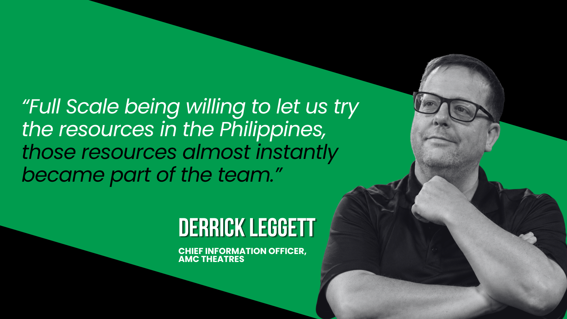
An engineering leader at AMC Theatres, which is based in my hometown of Kansas City, once described his week to me, and I’ve never forgotten it: “Every Monday, we do a production release. On Tuesday, we do two hotfixes, on Wednesday one hotfix, and if we’re lucky, none on Thursday.” That sounds terrible. It’s also completely average. Every release has fallout, and no amount of testing fully prevents it.
The pullback ratio is useful because it ties speed to quality in a single honest number. It overlaps with DORA’s deployment rework rate, but I find one ratio easier to feel than two separate numbers. A team that ships a ton and then spends three days a week firefighting isn’t fast. It’s in debt, and that debt has a real cost. A close cousin worth watching is defect escape rate, which is simply how many bugs made it all the way to production before anyone caught them.
The fix for a bad pullback ratio is almost always the same: smaller releases, more often. A big-bang release after two months of work is terrifying precisely because you know the pullback will be huge. The metric itself belongs on your dashboard, right next to the DORA numbers.
What no dashboard measures
Now the uncomfortable part. The best read I get on whether a team is actually doing well doesn’t come from any number. It comes from sitting in the stand-up and paying attention to three things.
The first is the quality of the questions people ask. A developer who’s engaged asks sharp, clarifying questions about the product, the architecture, and the requirements, and those questions get better as they go deeper. Silence, or vague questions, usually means someone is lost or checked out. This matters even more with remote talent, where you can’t read body language across a desk.
The second is the difference between confidence and confusion. Someone in command of their work carries a quiet confidence about it. Someone consistently confused about what they’re building has a problem that no productivity tool will surface for you.
The third is plain, visible progress. Is the work moving forward at a pace that feels reasonable for what was asked? A seasoned engineering leader can sense when progress is on track and when it has stalled, often before any metric catches up.
This is also the one honest use I’ve found for the activity metrics I just told you to throw out. When I get a gut feeling that someone isn’t getting much done, or I genuinely can’t tell what’s going on with them, I’ll go look at their commit history or their closed tickets. Most of the time it confirms what I already suspected. I’ll see they’ve barely committed anything, and now the hunch has a number behind it. But notice the order: the gut feeling came first, and the data only confirmed it.
The commit count was never the goal, and it can’t be a developer’s goal, because the moment it becomes the goal you’re right back to Goodhart’s law. Tracking a little activity to confirm the team is moving is fine. The mistake is making that activity the point.
None of that fits in a spreadsheet, and that’s the point. Gleb Braverman, who runs HackerPulse, put it well on my podcast: most problems on an engineering team are people problems more than technical ones, and metrics should inform how you lead rather than replace your judgment. The numbers are evidence. You still have to do the judging. Curiosity, the simple habit of asking good questions, is one of the strongest signals I have, and there’s no API for it.
How to measure a team you can’t see
The question I get more than any other from leaders weighing offshore software development or staff augmentation is some version of this: how will I know they’re being productive if I can’t see them?
My answer never changes. You judge it the same way you should already judge the team sitting next to you.
You measure it on results that reach the customer, the same as any team you can see.
Building a team across time zones forced me to drop the theater of measurement, the comfort of watching people look occupied, and rely only on outputs and delivery health. That discipline is exactly what makes a distributed team work. Across all those client teams we hold 93 percent developer retention, and that retention number is itself a signal worth tracking, because a team that keeps its people keeps its context.
This is also where cost-only thinking blows up. When the only reason you went offshore was to find the cheapest body, you end up measuring the cheap things, like hours logged and tickets closed, and missing the things that matter. I call that mistake cheapshoring, and it’s exactly backwards. Outcome metrics are how you run a distributed team well, while activity metrics just tell you who’s good at looking busy. Once your numbers tell you something is off, improving developer productivity is usually a leadership job before it’s a tooling one.
Software development metrics in the AI era
AI changes the volume but not the verdict. The 2025 DORA report found that AI now lifts software delivery throughput, a reversal from the year before, but it still drags down delivery stability unless a team already has strong testing and feedback loops. The line I keep coming back to is this: AI doesn’t fix a team, it amplifies what’s already there.
So the metric to watch as your team leans on AI is not how much code it produces. Output is going up no matter what. The number that tells you the truth is change failure rate, because that’s where the speed gets paid for if your foundations are weak. The right software development tools help, but the judgment is still yours.
The short list
Strip away the noise, and here are the software development KPIs I actually watch:
- One number tied to the customer’s outcome, the one that matters most
- Change lead time
- Deployment frequency
- Change failure rate
- The deployment pullback ratio
- The human signals from talking to the team, which no tool captures
That’s six things, and five of them fit on a chart. The sixth catches what the other five miss. Metrics exist to serve clarity and communication, the foundations of good engineering leadership. They don’t replace it. If you’re doing the job and talking to your team every day, you’ll feel most problems long before a chart flashes red. The day your dashboard starts making decisions for you is the day you’ve stopped leading.
Frequently asked questions
What are software development metrics?
Software development metrics are measurements that show how a team builds, reviews, and ships software, and how healthy that process is. The useful ones measure the delivery system and the outcomes it produces. The misleading ones, like lines of code or raw commit counts, measure activity, which is easy to inflate without producing more value.
What are DORA metrics?
DORA metrics come from the DevOps Research and Assessment program and predict how well an engineering organization delivers software. The current model uses five: change lead time, deployment frequency, failed deployment recovery time, change failure rate, and deployment rework rate. They’re valuable because they measure your delivery system rather than any individual developer.
Which software development metrics actually matter?
The ones that matter most tie to your customer’s outcome, a number that only moves when the customer wins. Beyond that, track change lead time, deployment frequency, change failure rate, and recovery time for delivery health, add a quality metric like a pullback ratio, and pay attention to the human signals a dashboard can’t show you. Skip lines of code, commit counts, and individual velocity rankings, which all reward the wrong behavior.
How do you measure a remote or offshore team?
Lead with outcomes instead of activity counts. The signals that travel across distance are what a developer ships and whether it survives production, so those are what you track. Build the dashboard around delivery health and customer results, and a remote or offshore team is no harder to read than one down the hall.
Want a team you can measure by what it delivers instead of how busy it looks? Talk to us about building your engineering team.